keep your curiosity sacred oh comely magazine
subscribe

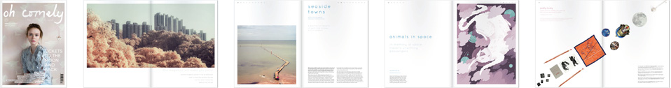
Dear readers, doodlers, designers and chefs. This is a fun, space-themed doodle challenge. A line-up of the best entries will be printed in Issue 17, due out in late August. Here's the deal.

The year is 3017. Alfred the astronaut has landed on Mercury, a planet so inhospitable that scientists way back in 2008 claimed no Human landing would ever be possible. But Alfred is a Human-Oid and--yes--he's up there on Mercury walking around, having a fag, and missing his Human-Oid grandmother who he's left behind on planet Earth2.

Photos: NASA's Messenger mission to Mercury.

Alfred meets an alien, and we'd like you to draw what this Mercurial alien looks like. All we have to help you is Alfred's fragmentary space report, sent just before his communications went down for reasons that are as yet unexplained.

"Hi, mission control! Alfred the astronaut calling. I first saw this alien on Mercury and when he spotted me his 4 toopers creased into what looked like a lovely smile. He was oval shaped, I would say, with a thin shadow and two large tephods. He carried with him a beautiful funigutts and ran very quickly on his --[inaudible]"

The recording cuts out there and we haven't heard from Alfred since, so your investigations into what exactly he encountered would be a great help. Email your entries to [email protected] by Thursday 1st August.

Footnote 347: The History of Earth2

Earth2 is the planet Alfred grew up on. Earth2 bears remarkable similarly to the climate and landscape of the original Planet Earth inhabited by Humans up to the year 2099. In that year, the Bigger Bang took place on a land mass on Planet Earth called "Norway". 10 so-called "Norwegian" teenagers were located in that region. Our research suggests that these 10 were smoking spliffs in a friend's bedroom, listening to music by the mythical goddess "Britney Spears" when the Bigger Bang happened. Now, while this is a space event yet to be fully understood, we think that when the Planet Earth exploded, only those 10 teenagers survived all other Human Beings. Their smokey bedroom was catapulted into the atmosphere along with a large chunk of Planet Earth's land mass, and this was the basis of the self-propagating Earth2 land mass that we know today. Crucially, this version of the Bigger Bang may also account for the effects "Britney Spears" music when enjoyed though the fog of well-rolled spliff. After all, "Being Stoned On Britney" saved the lives of those 10 teenagers and turned them into Human-Oids.

I graduated from an Illustration MA in 2010 with a positive response to my final project and was imbued with a sense of confidence. I quickly found that to be misplaced. Many illustration students leave university with a body of good work but without much knowledge of industry practicalities be those promotion, invoicing or licensing. Illustration can be a cruel mistress and a notoriously challenging career choice.

Enter Becoming A Successful Illustrator, a newly-published book that aims to inform aspiring illustrators as to the realties of the industry, right as they're emerging form the cocoon of higher education and highs of their graduate show.

Cover illustration by Steve Simpson.

Penned by the Association of Illustrators project manager Derek Brazell and freelance illustrator Jo Davies, the book is divided into six sections which cover the fundamentals of illustration practice, from identifying your market and approaching clients to licensing work in foreign territories. Unlike other illustration guides, this book does not just focus on editorial work but takes a broader look at illustration in its many guises.

The final two chapters deal with the less exciting aspects of freelancing, offering advice on contracts, licensing types, bookkeeping and tax registration. While the thought of these topics is enough to crack out the aspirin, nevertheless they're vitally important to an illustrator's career. This section is well laid out and avoids intimidating the reader by offering digestible nuggets of information not a field of business terms.

Each chapter is interspersed with quotes from practising illustrators and features case studies and interviews with a diverse range of commissioners and artists such as Jack Teagle and Gabrielle Adamson. These really bring the book to life and it's reassuring to know that many illustrators share the same struggles and insecurities when it comes to their work. Indeed, the book is beautifully illustrated throughout, with images from past Oh Comely contributors Rob Hodgson and Evgenia Barinova brightening the pages.

Although some of the advice, particularly the section on online promotion, seems obvious and a bit outdated Becoming a Successful Illustrator is a worthy read for any artist in the business. It's a great tool for the crop of new graduates about to embark on their careers. 

Find Laura's work at lauracallaghanillustration.com, and Becoming A Successful Illustrator here

In issue 14, we featured the designs of four trashy genre paperbacks that never existed. Their inventor, Jason Ward, describes his winding journey through the throw-away fiction of the Twentieth Century.

The Silent Tomorrow is a 1950s sci-fo novel. Design by Dani Lurie.

The idea for An Imaginary Library grew out of a conversation about the covers of old books. There are scores of long-forgotten genre novels that feature incredible art on their covers, often of a much higher level than the writing within.

Books that once cost 3’6 have artwork that you’d gladly have on your wall: the spare, chilling design of 70s “airport” horror novels, the alien landscapes and abstract imagery of 1950s science fiction, and the lurid sexiness of hardboiled detective novels. Dismissed at the time as populist and disposable, their existence provided an opportunity for talented artists to sell their work, and for some truly awful ones to prosper as well.

But instead of highlighting books that already existed, we decided to invent some of our own.

Death Carries a Spade is a hard-boiled 40s thriller. Illustration by David Doran.

I wanted all of the text to be completely original and yet seem authentic; my intention was for the books to feel as if you might actually find them in a second-hand bookshop.

The internet was useful, but it was rare to find examples of back covers, which are as fascinating in their own way as the front covers, loaded with hyperbolic quotes from long-defunct publications. My favourite was from The Green Odyssey by Philip Jose Farmer, described as a “Wonderful, lusty and roistering adventure…!”

Wanting to see the books properly, I spent several long afternoons joyfully searching real secondhand bookshops, the kind where the owners have non-ironic beards and the books are kept in bins.

Boot Hill is a 70s airport horror book. Design by Fab Gorjian

What I found most striking during my research was how many conventions there were for each genre, like the endless blurbs of detective novels and their tendency to be re-released again and again under completely unrelated titles. As if to compound the sense of disposability, hardboiled covers were pretty much interchangeable, usually with a scantily-clad woman either seducing or being threatened.

Even though the books themselves were churned out, they were created in a very specific way and with very specific language: it’s a given that a science fiction publisher would be called something different to a horror publisher, for example, but even the types of names of the authors (often pseudonymous) were different. Everything about them was designed solely to sell more copies, and yet from that naked pursuit of commerce some great art was made, wonderful, lusty and roistering.

Would you be interested in buying one of the book covers as a print? Tell us which one using this form.

Rain On Its Way is a piece of 30s modernist fiction. Illustration by Naomi Elliott.

The first collection of Grimm’s fairy tales was entitled "Children’s and Household Tales" and published in December of 1812. Two hundred years later, stories by the German brothers are still thrilling children and adults alike.

To celebrate two centuries of enchantment and magic seven illustrators will be interpreting these unashamedly dark stories for a Christmas exhibition at Foyles Bookshop. Inspiration is taken from classics, such as Hansel and Gretel, and less well known tales like The Golden Bird.

Included is work by Emma Block and Yelena Brysenkova, two past Oh Comely contributors, as well as our current Issue 13 illustration interviewee, Karolin Schnoor. Below is a preview of illustrations on show.

The Enchanted Forest: 200 Years of Grimm's Fairy Tales, is on display at Foyles Bookshop in Charing Cross, 29th November-8th December. More information here

oh comelyPhoto: Four Grimm's fairytales, by Karolin Schnoor, whose work is featured in Oh Comely Issue 13.

oh comelyPhoto: Emma Block's Hansel and Gretel. Emma has curated the show. 

oh comelyPhotos: Spots from Laura Barrett's book commission for Taschen's Fairy Tales, extracts of which will be on display.

oh comely

Caitlin Storrie is a recent graduate of Kingston University where she studied illustration and animation. I like her work: it's thoughtful and unsettling. It captures people's murky passions and the forgotten potential of everyday things.

A series of night drawings, for instance, sees Caitlin draw the residents of an apartment block from the perspective of a watching outsider. She encourages the viewer to imagine the story of those we don't know in a way that is utterly uncomfortable but very usual: people often stare at the lives of others, but few of us want to be caught doing it.

oh comely

I particularly enjoy Caitlin's series of drawings called 'Creative Cuts'. Here, she’s used discarded pens — think old highlighters from school and pencils that are biro stained — to draw tiny lines across huge pieces of paper. She's drawn these pens to death: scribbling and scribbling until there's no more ink left.

oh comely

The resulting work is abstract but also utterly ordinary. They remind me, yes, that old pens have a lot more ink than we care to use. But they also reveal and mimic the modern interest in the revival of rubbish. There's potential in what we throw away, be that ink from old pens or stories about strangers.

oh comely

For issue nine, we asked five illustrators about the best advice they'd ever had, and this is what they said. All the illustrators involved have interesting and different styles of hand-drawn typography, and you can click their names to browse more of their work.

Ben Javens: "My gran was a very slight woman and she told me that this is what she would do on windy days to stop her from being blown away. Being much bigger than my gran, I’ve not yet felt the need to take her advice."

oh comely ben javens

Mary Kate McDevitt: "This was my grandmother’s advice to my sister and I before we were even old enough to drink. When I take this advice I like to believe I exude the same elegance that my grandmother did."

mary kate mcdevitt oh comely

Anke Weckmann: "This is something my mum used to say to me. Once, when I was quite small, I drew on my face with pens and got a rash all over my body. She continued to say it to me for years whenever I got out my drawing things, even though I wasn’t tempted to draw on my face any longer."

anke weckmann oh comely

Sarah Abbott: "I tell myself this on an almost daily basis. A cup of tea won’t solve the world’s problems, but it definitely helps the small day-to-day woes. Pass me the kettle."

sarah abbott oh comely

Sarah Julia Clark: "Moving from house to house, it’s hard to make a room feel your own. As a hoarder of dresses, a friend once suggested I use these to decorate. Ever since, they have had pride position around every new bedroom, sometimes acting as temporary curtains."

sarah julia clark oh comely

The other week, we got a package through the post from Lord Whitney. We love receiving post, and this time it was a catalogue full of particularly curious set designs and arrangements of objects, just like this Spirit Bird.

oh comely lord whitney pick me up

It's the work of Amy Lord and Rebekah Whitney: the duo make installations for festivals, photo-shoots and many other things. We met Lord Whitney for a coffee on their way to the wonderful Pick Me Up illustration exhibition. We wondered what took their eye at the show, and asked them to tell us their highlights from the day.

Here are Lord Whitney's Pick Me Up best bits:

Kibbo Kift. The first late night at Pick Me up was hosted by Kibbo Kift, and it was a night of art, poetry and music. Our highlight was undoubtedly the curious and surreal poems of Matthew the Horse: an incredibly funny and talented linguist.  

Peepshow Collective's Museum of Objects & Origins. There's an artist in residence at Pick Me Up, and this year's is Peepshow Collective. They created a curious museum-esque collection housing arrays of artefacts from drawings, objects, prints and costumes. From the colourful characters of Chrissie Macdonald, to the graphic prints of Luke Best, this collective present an absolute feast for the eyes.

oh comely lord whitney pick me up

Sarah Maycock. We were blown away by the beautiful work of Sarah Maycock. Her painterly illustrations are created with some of the most exquisite mark-making we've seen. She's an extremely talented young illustrator. 

oh comely lord whitney pick me up

A Two Pipe Problem. We're big fans of traditional making techniques so fell head over heels in love with the work of Stephen Kenny's A Two Pipe Problem. Mixing traditional letterpress with a hint of magic, his prints have a timeless quality.

oh comely lord whitney pick me up

Kristjana S Williams

An opulent mix of Victorian prints, bright colours and gold leafing make the work of Kristjana S Williams a fantasy world we'd love to loose ourselves in. 

There's an illustrated story by Rob Hodgson in next issue and it was thanks to this that I came across his series of prints, Dwellings.

They're illustrations of remote buildings, with a sense of quiet mystery and self-possession. I felt like I'd come across an abandoned farm on a lonely winter walk.

rob hodgson old shed in woods

The illustration above is my favourite, Old Shed in Woods, and the one below is called Graveyard Tower.

rob hodgson graveyard tower